
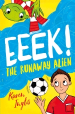
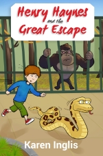
I’m delighted to announce that my latest children’s book Henry Haynes and The Great Escape – a graphic novel for ages 6-8 is finally out. This fun, fast-paced page-turner with short chapters is aimed at early readers from age 6 as well as slighter older ones looking for a quick and entertaining read. It also includes the first two chapters of Eeek! The Runaway Alien – my popular graphic novel for age 7-10 years in which an alien runs away to Earth for the World Cup!

Click to buy on Amazon
To celebrate Henry Haynes’s launch I’m running a Goodreads Giveaway – on which more below. Also read on to find out about new self-publishing lessons I learned.
First, here’s the all-important back cover blurb 🙂
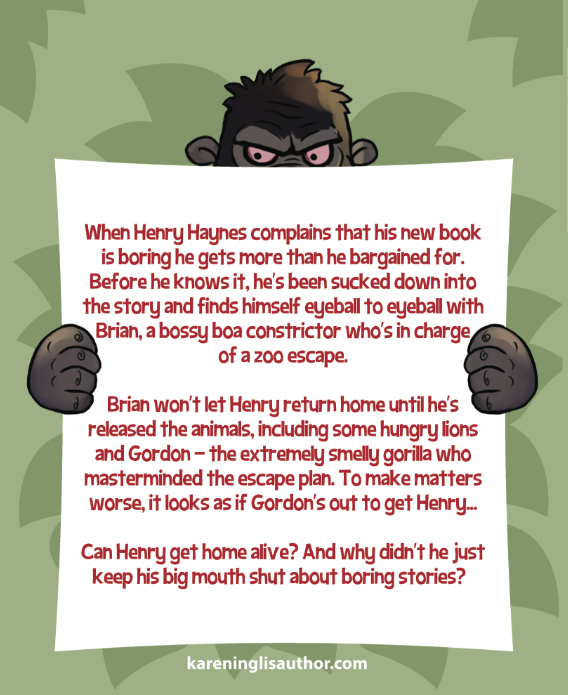
Fun and fast-paced for ages 6-8
Goodreads Giveway – ends May 12th
If you’re in the UK, USA, Canada, South Africa, Australia, New Zealand, or Singapore I’m running a Goodreads Giveway. If you happen to be a lucky winner please take the time to leave a review on Goodreads and Amazon. Follow the link to find out more – and good luck! (For info, the giveaway started today, May 5th and not May 2nd as shown…)
Three new self-publishing lessons learned…
Each time I publish a new book I learn something new. Three things I’ve learned with Henry Haynes’s release relate to:
- Supported and unsupported fonts
- CreateSpace UK’s ‘cream’ paper colour
- Using the same ISBN for Lightening Source and Createspace when selecting the CS for UK distribution
I cover what I learned about fonts below. In the interests of keeping this post to a manageable length, I will post about page colour and ISBNs later this week.
Supported and unsupported fonts
A key element within Henry Haynes is a story within a story – so I had to find a way to use different fonts to denote which was my story and which was the library book story that Henry Haynes was reading and fell into. After trying out a lot of fonts out I settled on Chalkboard. This is easy on the eye and provides a clear contrast from the book’s main typeface, which is Georgia. Chalkboard also works well in both normal and bold, which I needed it to do. You can see the mix in action in the screenshot below.
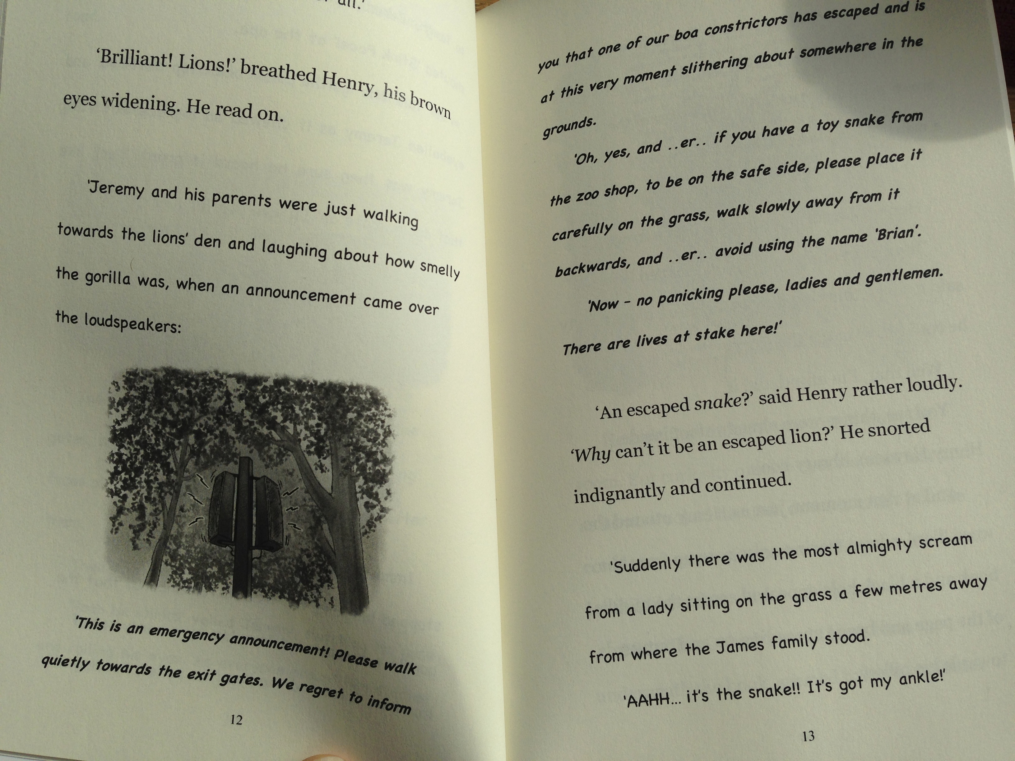
Mixed fonts – Georgia and Chalkboard – for my story within a story
However, what I hadn’t understood is that Chalkboard is not a fully supported font – this meant that when I converted the Word document into a print-ready PDF a lot of the punctuation marks displayed as hieroglyphics or were substituted with question marks. This was clearly disastrous – especially as I was at upload stage for my book! Here’s a small example from the bottom of page 13 above:
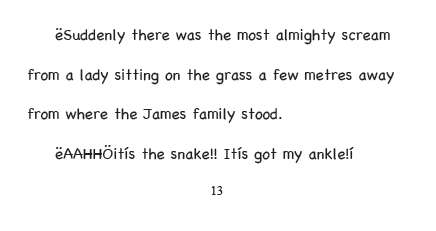
How Chalkboard text appeared when converted from Word to PDF
Doug at Lighthouse24.com – whom I use to create my print-ready PDFs – quite sensibly suggested that I change fonts for the ‘story within the story’. However, I was reluctant to do this as it worked so well in contrast to Georgia and I had already pretested and ruled out the look and feel of most of the other fonts with a similar feel. So as a workaround I found a similar looking font – Comic Sans – which did include all of the characters I needed. I then went in and swapped in the commas, dashes, speech marks and exclamation marks from it one by one. Due to different vertical spacing of Comic Sans from Chalkboard (something Doug had warned me to look out for) I had to reduce the type size by two points for all of these insertions, to prevent the swapped-in characters appearing slightly lower on the page. Luckily the internal story is quite short so it wasn’t too much work – had it been much longer I’d have been in deep trouble!
The moral of the story is, if you’re thinking of using an unusual font in your manuscript, check that the characters and symbols you want to use are included in the font’s basic code set. If the obvious ones you need aren’t there (and based on my experience, I’d look out for apostrophes, opening and closing speech marks, dashes, and dots like these three…) ideally choose another font! Otherwise your only option is to substitute in the way that I did – something that is really only realistic for limited amounts of text.
How to check a font’s code set if you’re on a PC
- Click Start > All Programs > Accessories > System Tools > Character Map.
- Now select your chosen font from the pull down menu – this will display every available symbol and character in that font.
How to check the font’s code set if you’re on a Mac
I can’t currently work out how to do this without using Word – please leave a comment below if you know! In the meantime one other way to check is as follows:
- Open a Word document and then choose Insert > Symbol.
- From within the window that appears find the font dropdown menu and select your chosen font.
- You should now see a table that displays the basic characters and symbols (“glyphs”) for that font
- Check that the common ones you’ll need are all there, such as open and close quotes, bullets, and dashes etc
- If there are no characters showing at all, then it’s likely you will run into trouble when converting the Word file to PDF….!
Read an in-depth review of Henry Haynes on Debbie Young’s blog
I popped a review copy of Henry Haynes in the post to journalist and book reviewer, Debbie Young, on Friday. I was bowled over to find a blog post from her on Sunday morning. Debbie is an avid reader and, amongst her many roles, has worked with a leading children’s reading charity Readathon. You can read Debbie’s review here.
Where to buy Henry Haynes and The Great Escape (£4.99/$4.99)
You can order Henry Haynes from most online bookstores – and from most UK/US and Australian bricks and mortar bookshops. The links below offer just a few examples of where to find it online. I’ve not included Waterstones as they are showing the wrong price for it at £5.99 when it should be £4.99! I shall, however, be signing copies at Waterstones in Putney on Saturday 14th June 🙂


I have a question. I’ll admit, I have not seen your full book from the picture above. I noticed your picture is B&W. I publish adult romances now and know all about that, but a children’s book is new territory for me. I’m writing a book now for my oldest son’s age group 7-10 maybe.
I have an illustrator and I’ve decided I want the black and white comic book look. No color. Would I have to choose full color because I’m using pictures?
And what is the best way to put pictures into the book. I use word for my other books and at one point I put a picture to replace asterisks. Every page that had the symbol made the font lighter in shade than the pages without.
Any advice would be great! Thanks
Thanks, Nicola – I will be in touch a bit later re blog post for you….it’s been a bit manic the last few days!
Congratulations. The book sounds great. I think my seven year old daughter would love that.
Congratulations on yet another book Karen. Hope it sells well!! Your cousin Bernice in Canada.
Thanks, Bernice! I hope so!!!